
A composable function always has the annotation @Composable. Within the function the basic building block is declared
and describes the UI. It might contain several UI elements.
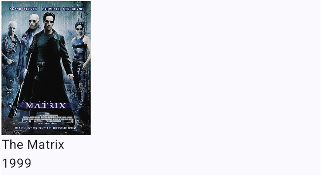
@Composable
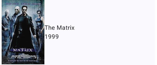
fun MovieItem(movie: Movie, onMovieClick: (Movie) -> Unit) {
AsyncImage(model = movie.poster, contentDescription = "poster")
Text(text = movie.title)
Text(text = movie.year)
}
In most of the cases you can just use the standard layout elements like Box, Row or Column to place the items on
the screen.
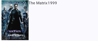
@Composable
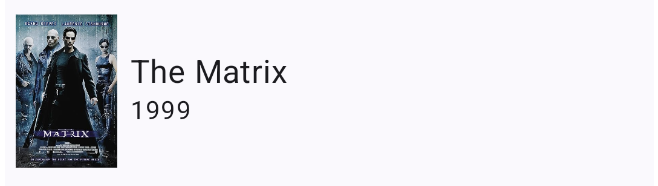
fun MovieItem(movie: Movie, onMovieClick: (Movie) -> Unit) {
Row() {
AsyncImage(model = movie.poster, contentDescription = "poster",)
Text(text = movie.title)
Text(text = movie.year)
}
}
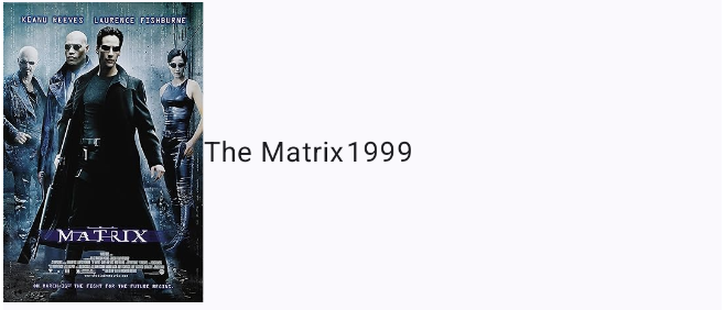
There are also properties to align the elements accordingly:
@Composable
fun MovieItem(movie: Movie, onMovieClick: (Movie) -> Unit) {
    Row(verticalAlignment = Alignment.CenterVertically) {
        AsyncImage(model = movie.poster, contentDescription = "poster",)
        Text(text = movie.title)
        Text(text = movie.year)
    }
}
You can also nest elements like you need them:
@Composable
fun MovieItem(movie: Movie, onMovieClick: (Movie) -> Unit) {
    Row(verticalAlignment = Alignment.CenterVertically) {
        AsyncImage(model = movie.poster, contentDescription = "poster",)
        Column {
            Text(text = movie.title)
            Text(text = movie.year)
        }
    }
}
A special property is the Modifier. This can be used to change the size, layout, behaviour of the element. You can
also add information like accessibility labels or test tags. You can also make elements clickable.
Please keep in mind that the order of the modifiers functions is significant because this can affect the final result.
@Composable
fun MovieItem(movie: Movie, onMovieClick: (Movie) -> Unit) {
    Row(verticalAlignment = Alignment.CenterVertically) {
        AsyncImage(modifier = Modifier.width(80.dp).padding(8.dp), model = movie.poster, contentDescription = "poster",)
        Column {
            Text(text = movie.title, fontSize = 20.sp)
            Text(text = movie.year)
        }
    }
}
To keep in mind that there are still old apps around you need to now the most common types of layouts:
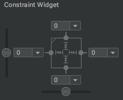
A ConstraintLayout is a android.view.ViewGroup which allows you to position and size widgets in
a flexible way.

A layout that organizes its children into a single horizontal or vertical row. It creates a scrollbar if the length of the window exceeds the length of the screen.

Enables you to specify the location of child objects relative to each other (child A to the left of child B) or to the parent (aligned to the top of the parent).
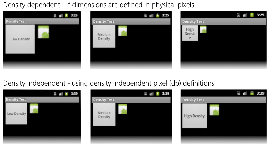
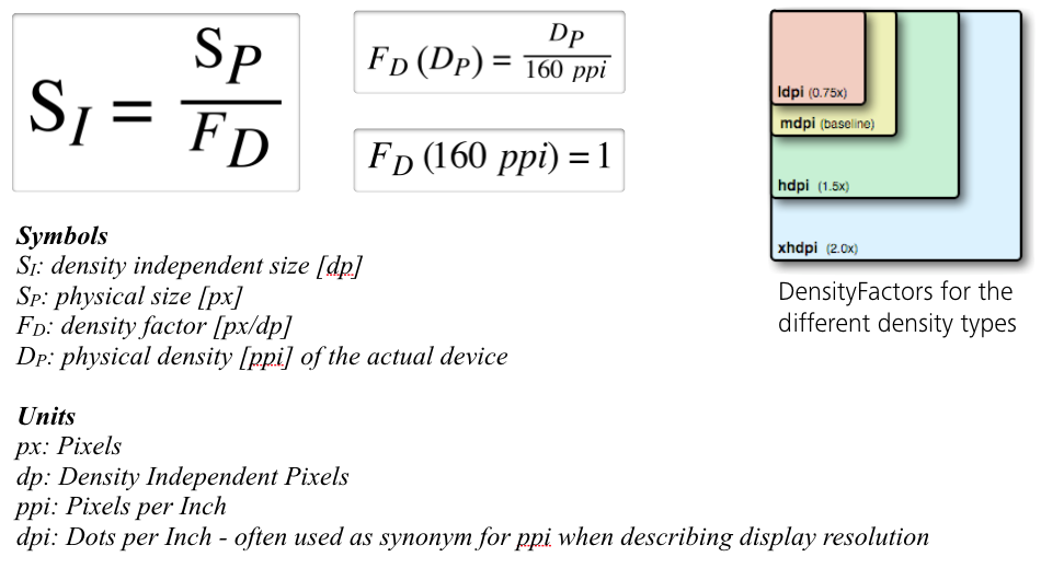
Sizes of view components should be defined in Density Independent Pixels (dp) in order to always get the best results.
More information here.